

In every industry there is some dumb, stupid and pointless topic which has no correct answer that for whatever reason is discussed and argued about ad nauseam.
For a designer like myself that topic is Typefaces. Yeah! Fonts. You know Times New Roman, Arial, Century Gothic. Most people spend their entire life just caring about which font makes their 8 page paper appear to be 12, but not us. We define them, give them personalities. Use words like contemporary, trendy and distressed. Ascender, Decenders, Serifed and Sans Serifed. We kern them, we lead them. We stretch them, we slice them. We know which ones work well together and which ones don't work well at all (ehem... I'm talking to you Hobo and Comic Sans!)
I only use this. How dare they use that. IKEA is switching to what!?! It goes on and on.
I'm guilty. We all are.
But this nice illustration/map/chart called "So you need a typeface?" from Julian Hanson might make at least the whole decision process a lot easier.
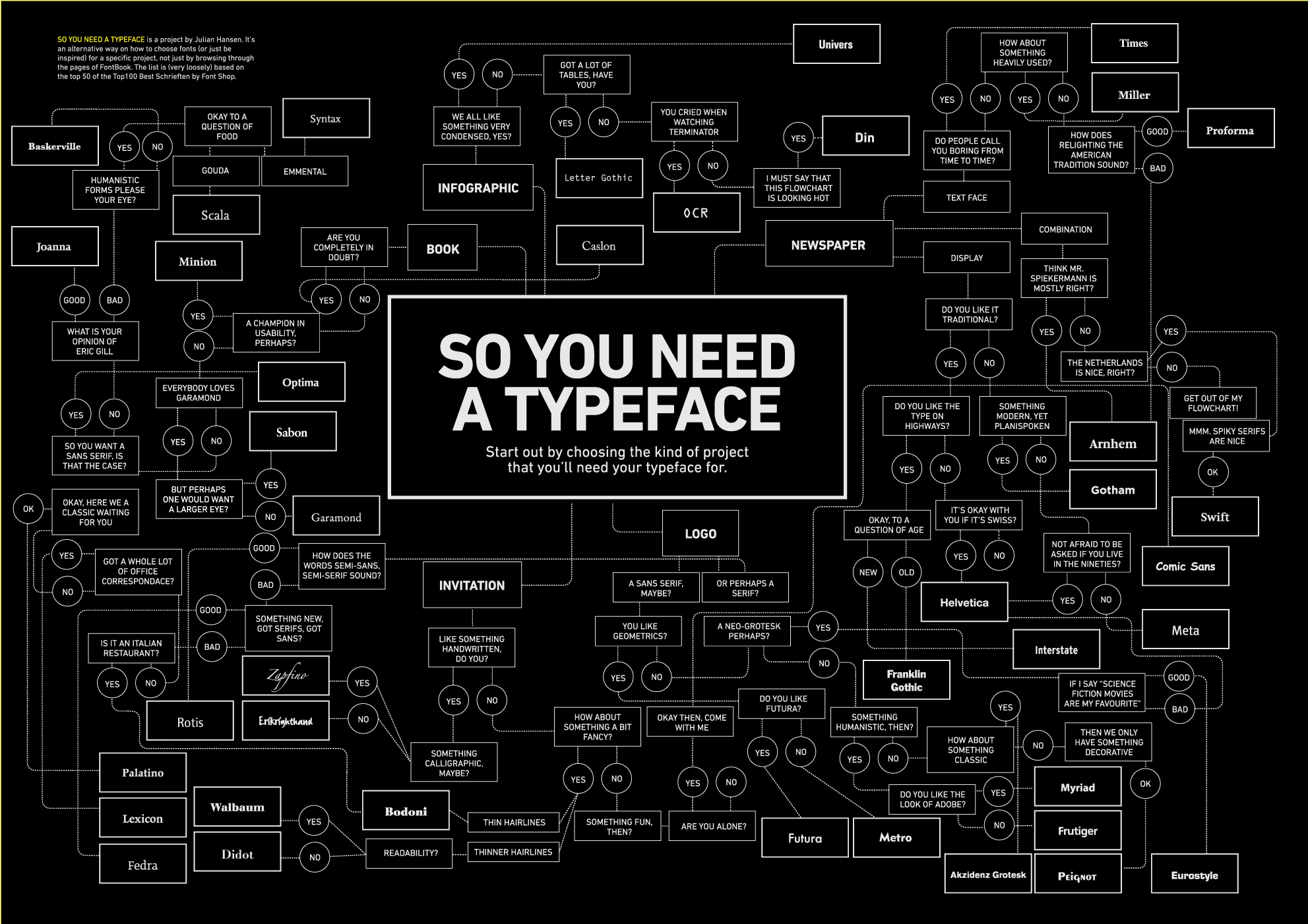
It also give some good justifications for why to use a font, which is applicable to both designers and the average lay person. Takes you through the whole process.
Take a look and follow the yellow brick road to you ideal typeface.
No comments:
Post a Comment