Showing posts with label Product design. Show all posts

Monday, June 1, 2009

Walmart's Great Value - Before and After


So I'm stealling this blog post from one of my favorite design blogs The Dieline.

They recently discussed the new look that Walmart has given to their Great Value product line. You know, the box of cereal or bottle of ketchup that cost a dollar less, but looked as if it had been sitting on the shelf for 12 years and had probably been opened and resealed.

Well for all the flaws of the world's biggest retail chain, both moral and aesthetic, they tried and I feel succeeded in this endeavor to build a stronger brand for their line of cost conscious products.

Check out this before:


And look where they're at now:


Not a bad job. Now if they could just do something about they're "Big Box" architectural style. I know, I know... big box means a small price for me. I don't know though, I might be willing to pay a bit more to avoid feeling like a redneck for shopping there.


On a side note, it has been brought to my attention that my comments section doesn't work all the time, I'll fix that immediately. I really encourage anyone who reads to comment as much as possible, especially about that "redneck" line. Thanks as always.

Tuesday, March 31, 2009

Awesome Packaging Design


After my beer post yesterday, i got to thinking about how terrible the packaging for the Hoppin' Frog B.O.R.I.S The Crusher is. For such a deliscious beer, it looks like it would taste like Frog crap and swamp water, and trust me the consitency of the beer doesn't help in relieving that concern either. It wouldn't surprise me if some would just pass it up just for that reason.

Now, mind you I am the type of person who chooses wine based on bottle design and label, not quality, age or grape. Not so much with beer, but sometimes I'll give a beer a try just because I like the design.

A perfect example is the above beer and its gorgeous packaging. The Howling Monkey Black and Tan is damn near perfectly designed all way down to the choice of bottle. The design firm Tuner Duckworth can take well deserved credit here for an amazing capture of a brand.

I can't wait to try this beer, and I don't even like black and tans. I mean I'll drink them if they are done right. This is what I mean by done right:


But what we have with Howling Monkeys and with any black and tan in one bottle is what a 8 year old me would call a "suicide". A "suicide" is essentially every flavor of soda from the fountain, including but not limited to Coke, Sprite, Orange, Root Beer, and Mr. Pibb (none of this Pibb Xtra bullshit... what's Xtra?... another post I guess). Just like a black and tan in a bottle it always tasted OK, but never as good as each flavor would have on its own. Especially if Hawaiian Punch came into play... never a good compliment to any other soft drink.

This kid has the right idea, and I can admit that he's a stronger man than I.


But I digress.

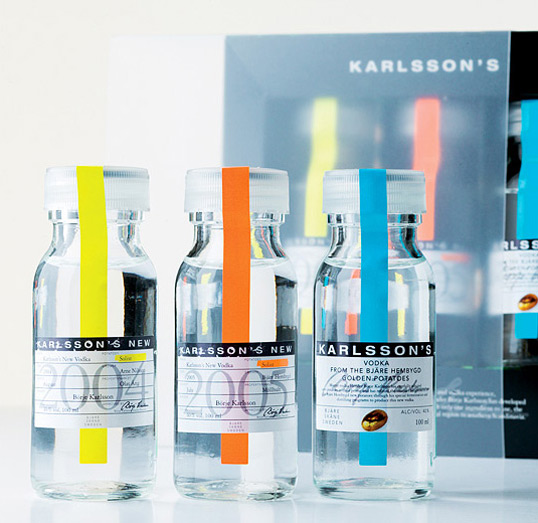
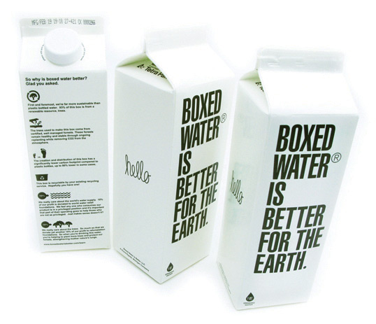
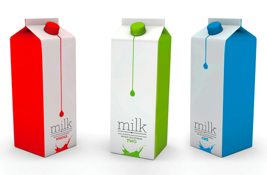
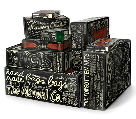
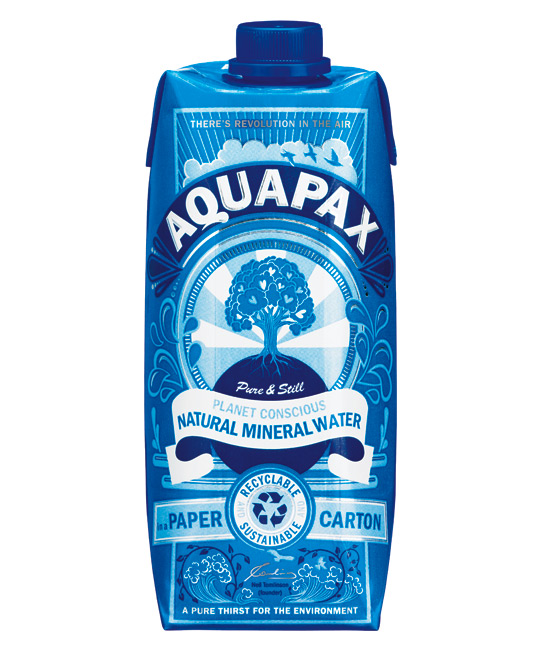
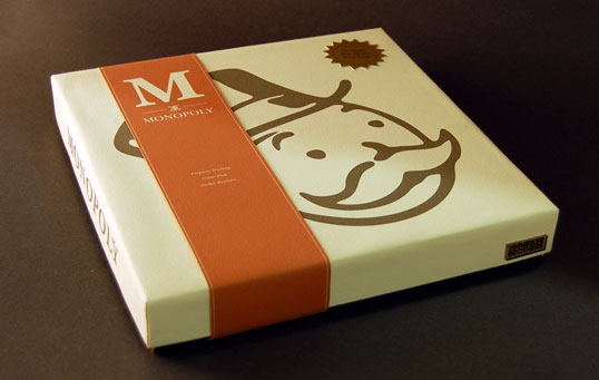
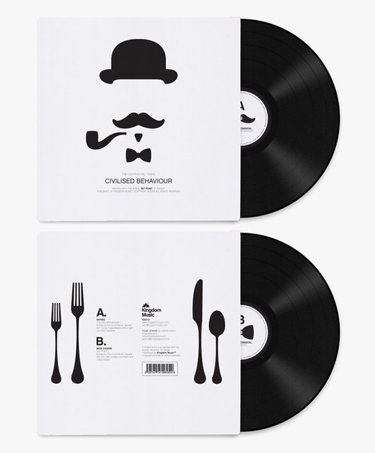
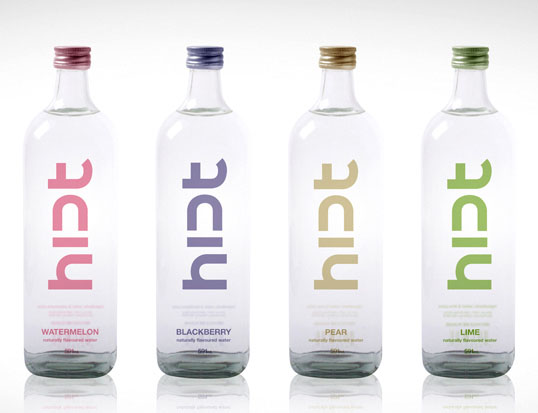
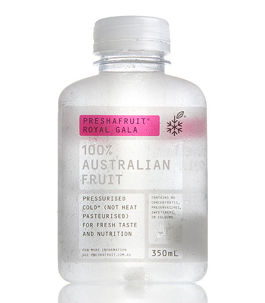
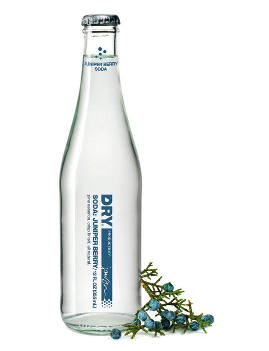
Here are some amazing packaging designs I have been seeing on this great site Lovely Package. Check them out:


Check out the site for some great inspiration, or just awesome products that probably aren't half as awesome as their packaging.

Monday, March 9, 2009

New Inspiration: Graphic Exchange


So last week I was looking for inspiration for a few projects we're kicking off here.

I stumbled onto this Blogish site through another of my faves FFFFound.com.

It's called Graphic-Exchange and I am seeing some amazing work being put forward for consideration.

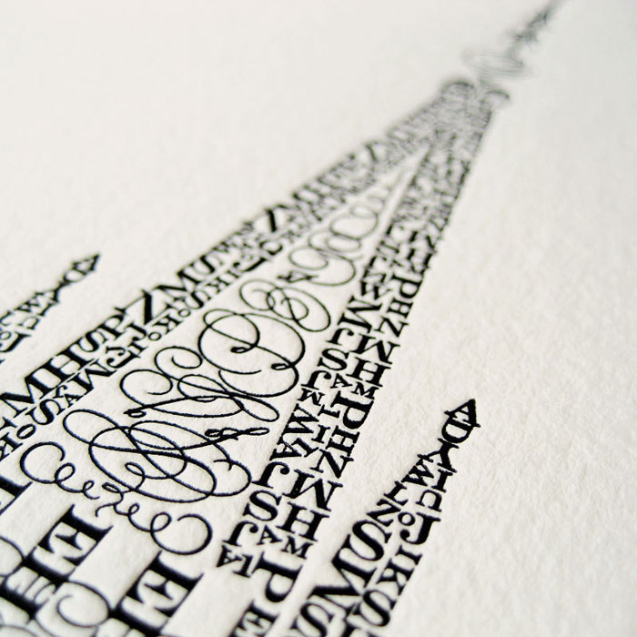
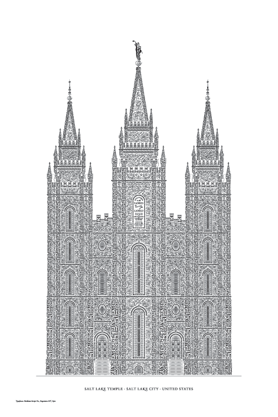
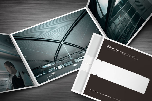
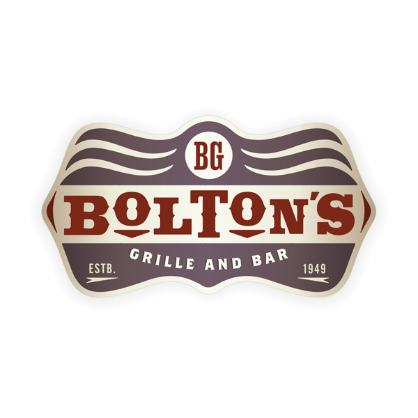
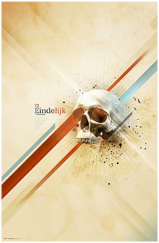
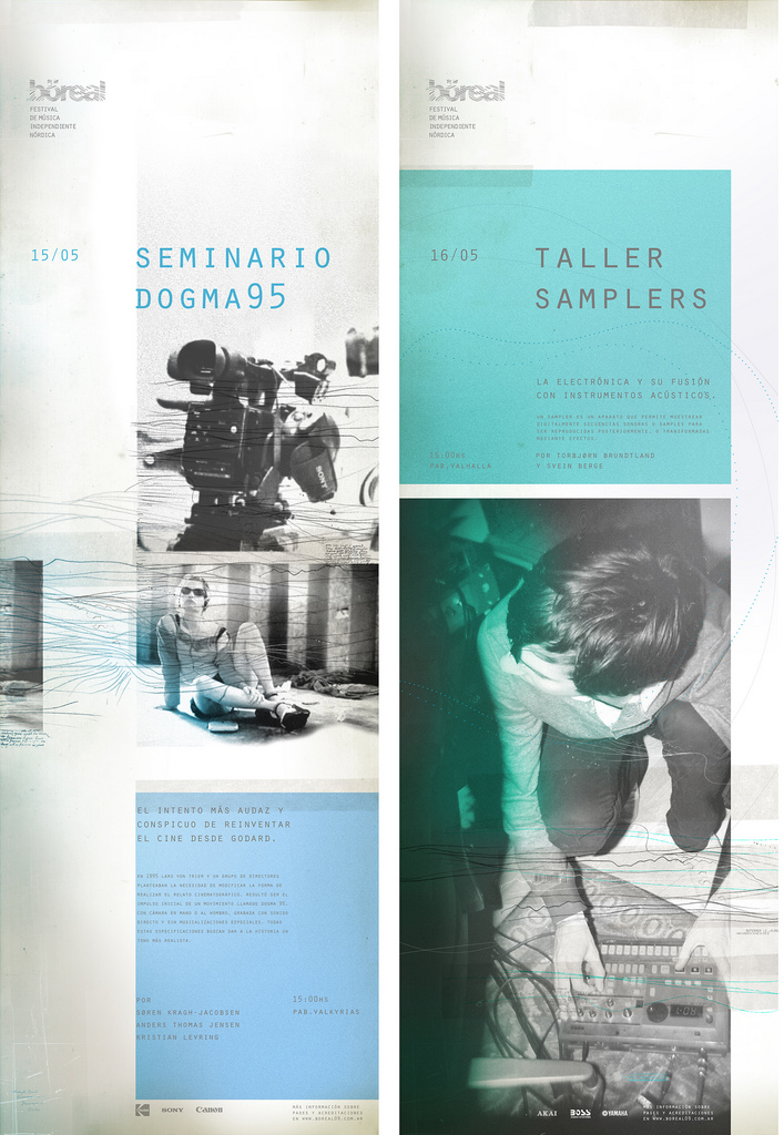
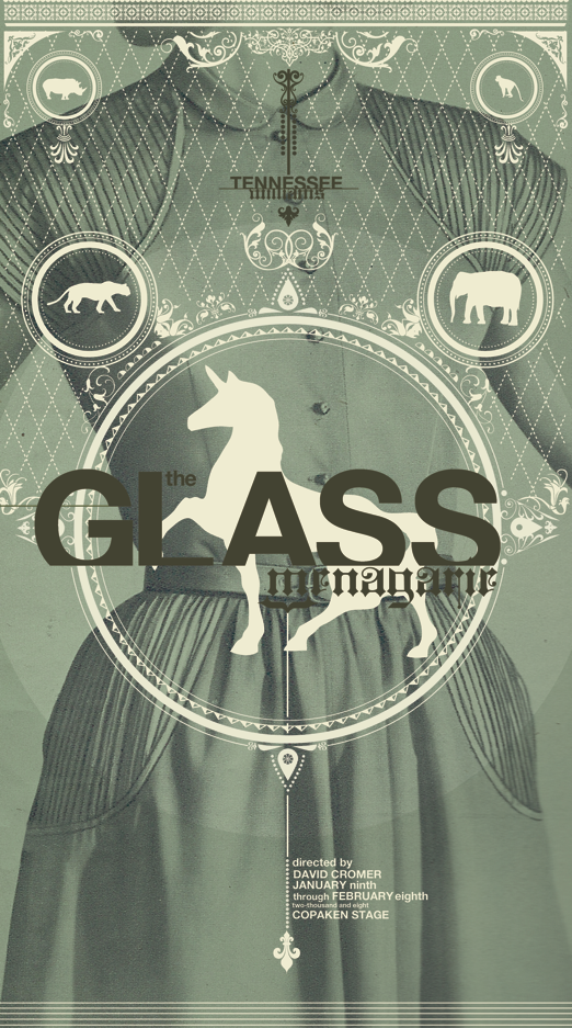
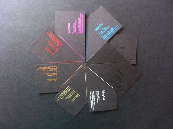
Here are just a few examples:


The usability is random, and the load time is excessive, but the work up for discussion is second to none. This is a great resource for design trends and inspiration. It'll make you mad how good some of this work is.

Fabien Barral is the guy who runs the site and he describes it like this, "graphic-exchange is an alternative to the "links only" web site, showing you the a selection of work directly on this site. I also use it to present my own work."

He's from France.

I get the sense from the site that designers can "exchange" professionally printed work with Fabien, post their work for his approval and posting, or just read and enjoy what is and can be done in the world of design.

Lastly, I like this autobiography. He describes himself this way, "I am a husband and I love my wife. I am a father and I love my daughter. I am not the clients I work with, I am the art I create with them. I am what I create. I create what I am."

I'll probably steal that, sorry Fabien.

Check it out, and be inspired

Tuesday, February 10, 2009

Objectified


I was reading from a blog I frequent from artist Scott Hansen, and he had posted the trailer to Objectified.

This is Director Gary Hustwit follow up to the critically acclaimed (among designers anyway) Helvetica.

The film appears to take a look at products and everything that goes into bringing them to fruition. It focuses on design, and it's forward looking nature.

Check it out, I'll probably see it. I'll probably love it.