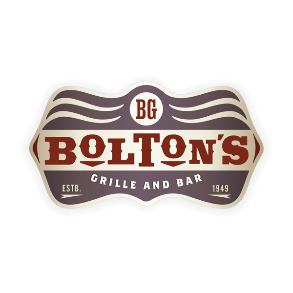
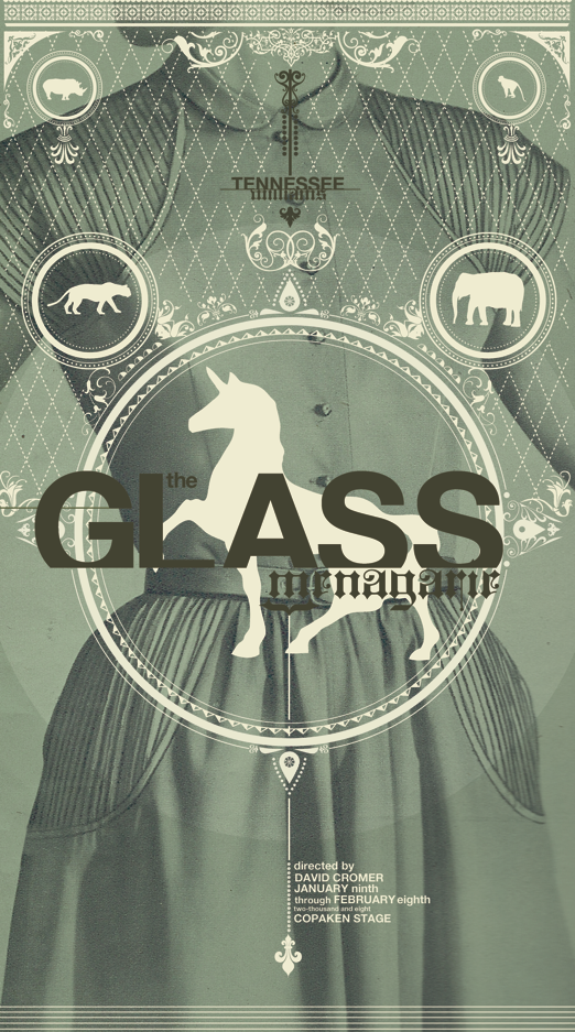
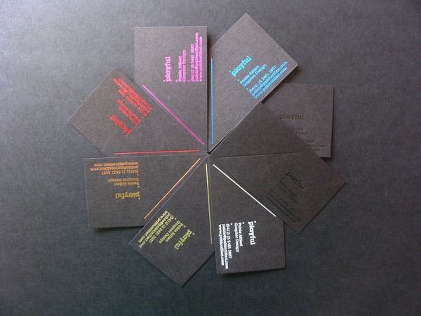
FAME a branding agency from Minneapolis chose a "dive bar" theme for an open house they put on. They did an amazing job with both design and copy.
I love when a company lets their creatives go all out for something non-client related. I see no better way of proving how you can propel a client's brand and culture than to dominate your own brand through design and culture.
The average client might be scared to try something new. Out of the box. I once had a client ask me not to use gradients for fear their customers might not be ready for that yet... true story. But if you can do amazing, fun, different, game changing work for yourself and show clients the results, they will feel much more comfortable. In fact, they will probably come asking for it.
By daily I mean I did it yesterday, and I'm doing it today. That might be as long as my scattered brain will take this. Let me know what you think of my monkey.
Original:
ChuckStyle:
Alright.
Now as for commenting on my blog. It has once again been brought to my attention that people are having trouble commenting. That makes me sad because I love reading comments. I'll try to fix it, the only advice/request I can give you is to keep trying to post you coments. Multiple times. Maybe even copy and paste before you submit, then if it doesn't go through, you can just paste it again as opposed to retyping.
It's not ideal, but I'm working on it. You can also post on my Facebook page.
So I'm stealling this blog post from one of my favorite design blogs The Dieline.
They recently discussed the new look that Walmart has given to their Great Value product line. You know, the box of cereal or bottle of ketchup that cost a dollar less, but looked as if it had been sitting on the shelf for 12 years and had probably been opened and resealed.
Well for all the flaws of the world's biggest retail chain, both moral and aesthetic, they tried and I feel succeeded in this endeavor to build a stronger brand for their line of cost conscious products.
Check out this before:
And look where they're at now:
Not a bad job. Now if they could just do something about they're "Big Box" architectural style. I know, I know... big box means a small price for me. I don't know though, I might be willing to pay a bit more to avoid feeling like a redneck for shopping there.
On a side note, it has been brought to my attention that my comments section doesn't work all the time, I'll fix that immediately. I really encourage anyone who reads to comment as much as possible, especially about that "redneck" line. Thanks as always.
And the winner was: Nicely done indeed, and a quality choice for winner by Chuck Anderson. But some of the others had merit, and I liked them because they pulled from further back in Chick Flick history.
The amazingly talented designer Chuck Anderson at NOPATTERN posted a twitter challenge on Saturday night, and it was so random that I had to partake right away.
I don't think it's what he's looking for, but here's what I came up with:
What do you want, its 1 AM?
You do one too and send it to me (buzzbuzzflicker@gmail.com), I'll upload to my blog for all to see.
Send it to Chuck too. You never know.
Also, check out his work, it's incredible. He is a god when it comes to lighting effects. He is one of my go-to guys for inspiration these days.
After my beer post yesterday, i got to thinking about how terrible the packaging for the Hoppin' FrogB.O.R.I.S The Crusher is. For such a deliscious beer, it looks like it would taste like Frog crap and swamp water, and trust me the consitency of the beer doesn't help in relieving that concern either. It wouldn't surprise me if some would just pass it up just for that reason.
Now, mind you I am the type of person who chooses wine based on bottle design and label, not quality, age or grape. Not so much with beer, but sometimes I'll give a beer a try just because I like the design.
A perfect example is the above beer and its gorgeous packaging. The Howling Monkey Black and Tan is damn near perfectly designed all way down to the choice of bottle. The design firm Tuner Duckworth can take well deserved credit here for an amazing capture of a brand.
I can't wait to try this beer, and I don't even like black and tans. I mean I'll drink them if they are done right. This is what I mean by done right:
But what we have with Howling Monkeys and with any black and tan in one bottle is what a 8 year old me would call a "suicide". A "suicide" is essentially every flavor of soda from the fountain, including but not limited to Coke, Sprite, Orange, Root Beer, and Mr. Pibb (none of this Pibb Xtra bullshit... what's Xtra?... another post I guess). Just like a black and tan in a bottle it always tasted OK, but never as good as each flavor would have on its own. Especially if Hawaiian Punch came into play... never a good compliment to any other soft drink.
This kid has the right idea, and I can admit that he's a stronger man than I.
But I digress.
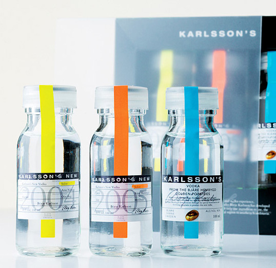
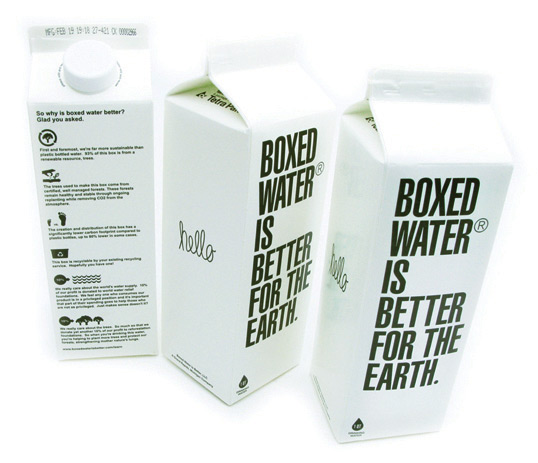
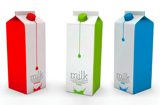
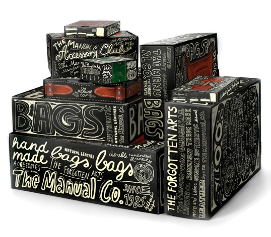
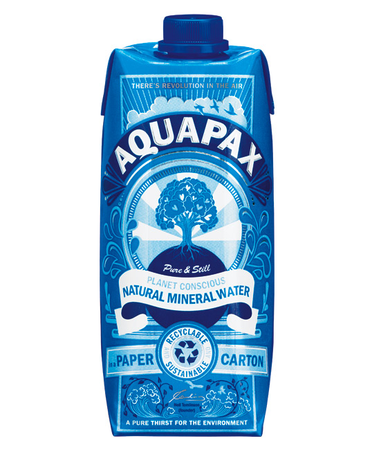
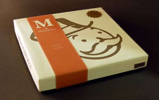
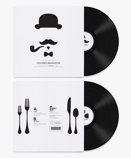
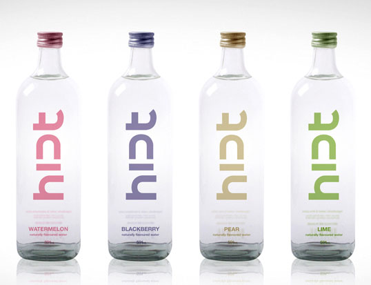
Here are some amazing packaging designs I have been seeing on this great site Lovely Package. Check them out:
Check out the site for some great inspiration, or just awesome products that probably aren't half as awesome as their packaging.
Anybody who has ever had to go without Jack in the Box for a prolonged period of time knows that their extensive menu and cult following is unmatched in the world of fast food. Even if you don't eat there (which I haven't in probably 3 years), you have to hear about it from those who do or haven't been able to in a while. And it usually goes like this, "Ooooo... Jack in the Box, that sounds so good right now!"
Well they have changed their image, beginning with a Superbowl commercial where we almost lost Jack (the confident and quippy faux-CEO and figure head, literally, of the restaurant chain) to a tragic bus accident. And has extended into a social media phenomenon with 80,000 opt-in notes to Jack during his 6 week recovery, as well as other viral efforts and games.
Jack in the Box has a long and interesting Advertising history. After the clown-like character was destroyed in a 1980 bombing to make way for a new more mature Jack in the Box, called Monterey Jack's for a time. This was an epic failure, and the company returned to the Jack in the Box moniker in 86'. But the clown head ordering station remained in exile.
That is until 1994. Coming off what some might call a PR nightmare, the death of four children to Salmonella poisoning, Jack in the Box was ready for a new direction. Dick Sittig and the agency Secret Weapon responded with what could have been bland if done any other way. Bring Jack Back!
Something that isn't a hugely known fact is that Dick Sittig and Jack have eerily similar voices. Ok, they're the same. Talk about securing a client. Make yourself the mascot. I would have loved to be in that meeting.
Well the Jack's Back campaign and subsequent marketing efforts have been off the charts successful by anyones standards. Jack is even popular in areas that don't have the chain in their region. Antenna balls with Jack's holiday likeness still grace cars every year. It hasn't gotten stale in 15 years. But that doesn't mean it wasn't time for a face lift.
During Superbowl XLIII this happened:
Subsequent videos and extensions were circulated for the next 6 weeks from www.hangintherejack.com, and utilizing Youtube, Twitter, Facebook and Blogs, as well as Traditional In Store, Outdoor, PR, Print and Broadcast media.
And what has it all lead up to? Here it is.
From my favorite design agency, Duffy & Partners in Minneapolis, MN, the new logo offers a classier and more modern feel, coupled with the excitement and charisma that has been established by the Jack in the Box brand. The new brand will be reflected in both advertising and in store, and the hope is that t will account for a cleaner and more enjoyable experience, and increased sales.
Jack's not going anywhere, but I feel the the restaurant might be. New markets, more locations and better exposure all around.
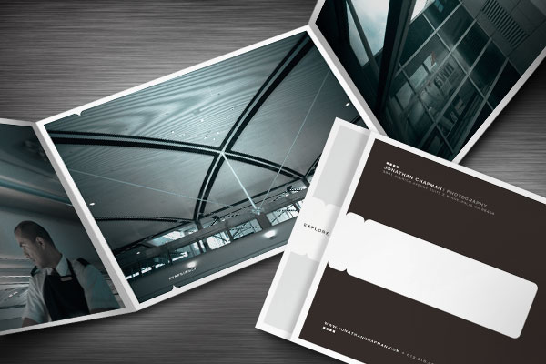
So last week I was looking for inspiration for a few projects we're kicking off here.
I stumbled onto this Blogish site through another of my faves FFFFound.com.
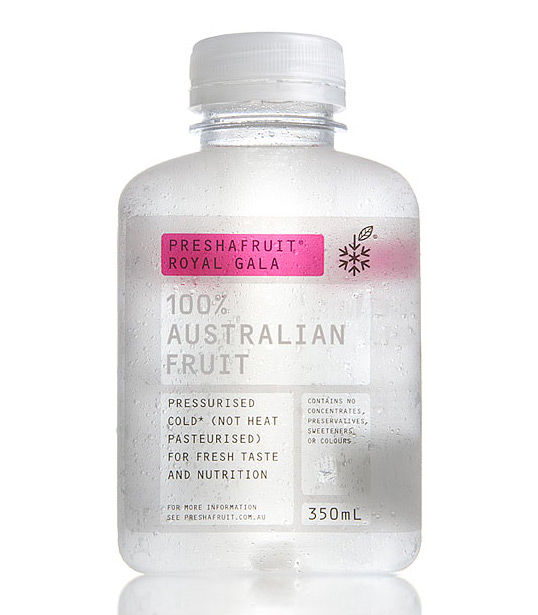
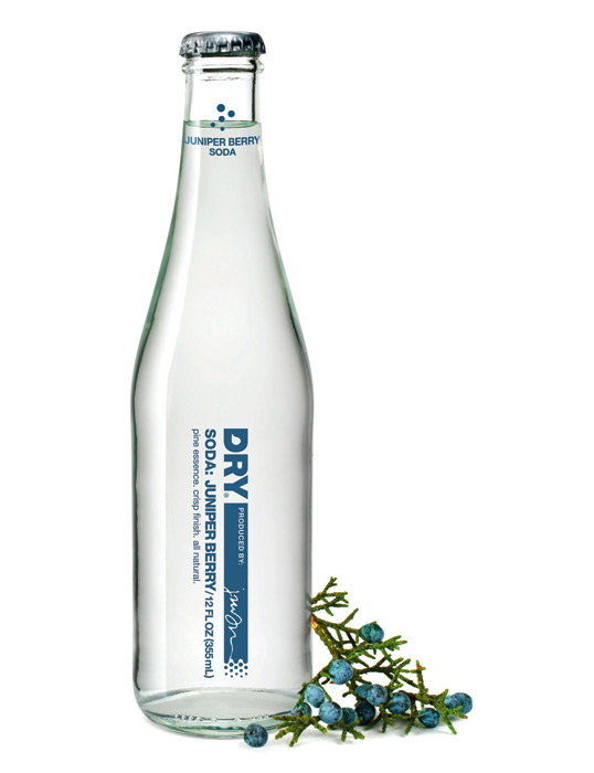
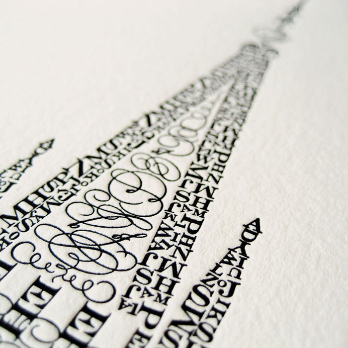
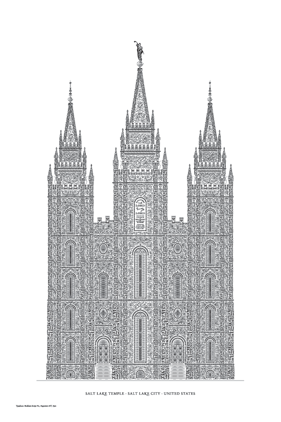
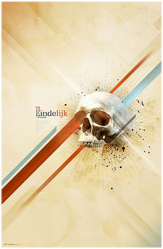
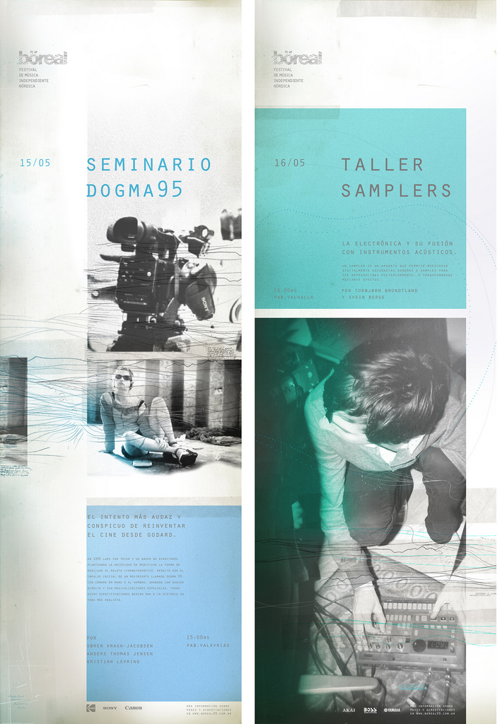
It's called Graphic-Exchange and I am seeing some amazing work being put forward for consideration.
Here are just a few examples:
The usability is random, and the load time is excessive, but the work up for discussion is second to none. This is a great resource for design trends and inspiration. It'll make you mad how good some of this work is.
Fabien Barral is the guy who runs the site and he describes it like this, "graphic-exchange is an alternative to the "links only" web site, showing you the a selection of work directly on this site. I also use it to present my own work."
He's from France.
I get the sense from the site that designers can "exchange" professionally printed work with Fabien, post their work for his approval and posting, or just read and enjoy what is and can be done in the world of design.
Lastly, I like this autobiography. He describes himself this way, "I am a husband and I love my wife. I am a father and I love my daughter. I am not the clients I work with, I am the art I create with them. I am what I create. I create what I am."